Gesture controlled windshield UI for semi-autonomous vehicles
Overview
The Cerence multi-modal project, in collaboration with the German Research Centre for AI (DFKI), explores how a semi-autonomous vehicle could incorporate multiple user interaction types to allow natural and hands-free communication in a vehicle setting. As lead designer on this project, I was challenged with combining multiple modalities into a single mental model, and defining the gestural, speech, and graphics interfaces. The final product is a fully functioning windshield equipped with a gesture camera, eye tracking camera, short-throw projector, and voice recognition platform. It first debuted at CES in Las Vegas on January 11, 2020.
Role: Lead UX designer – Graphic, voice, and haptic modalities
Dates: September 2019 - January 2020
Team: Markus Funk (lead UX researcher), Alexis Doreau (UI design)

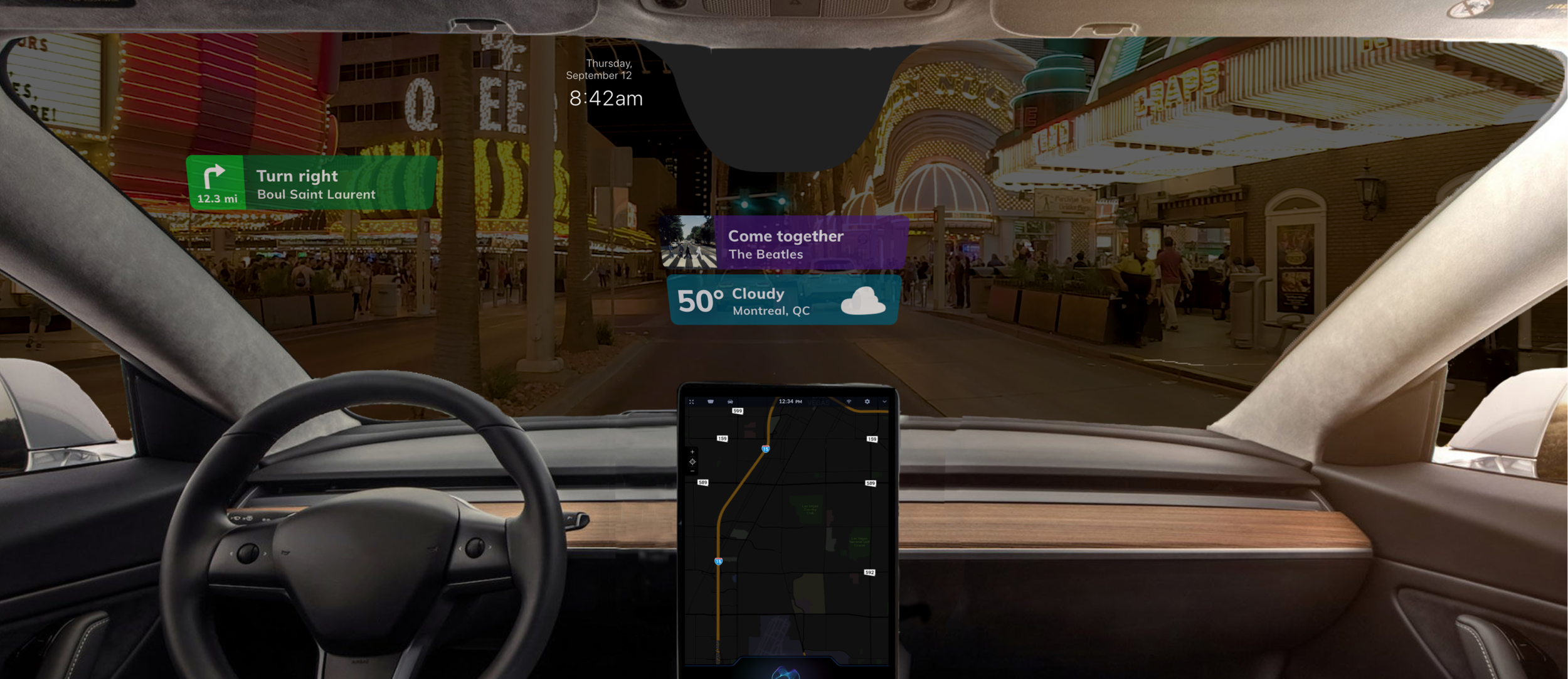
Final HUD UI
Background.
Much of human-human communication uses non-verbal information. The sentence: “What’s that over there”, requires knowledge of the speaker’s head, body, or eye position. For a machine to understand natural commands such as this, it must make use of gestural, tactical, eye tracking, and verbal information. As voice assistants in cars improve their ability to interact with drivers, it is desirable for them to understand non-verbal communication as well as spoken communication.
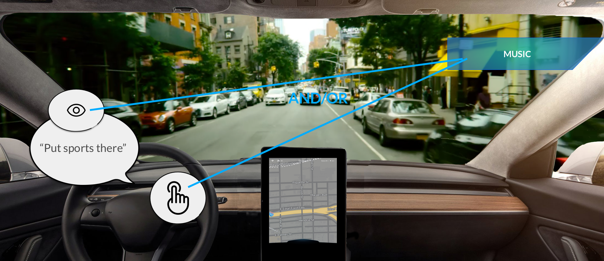
With the upcoming introduction of autonomous vehicles (AV) into the automotive market, drivers – unburdened from the necessity to drive – will soon be able to interact with more digital content inside their vehicle. My team was challenged to consider how a windshield and advanced communication technology might be used to connect drivers with their desired digital media. Since users are unable to touch the windshield itself, gesture, eye-tracking, and voice modalities enable users to for the first time make use of such an interface.
The Problem.
Researchers studying level 3 and 4 autonomous vehicles – projected to reach the market over the next 5-10 years – recommend that drivers maintain consistent low-level attention to the road, even while their car is operated by the machine. To encourage drivers to keep their eyes on the road, even while their hands are not controlling their vehicle, windshield UI’s and heads-up displays (HUD) have been proposed as a possible solution.
How might drivers interact with desirable digital content, while still paying a low level of attention to the road?
Starting with a definitive goal
Working with innovative new technology like eye tracking cameras and gesture sensors introduces in itself a fun exploration, however explicit goal setting it always a critical component of my design process. To ensure the entire team were working towards the broader company vision, I implemented a goal-setting survey carried out between all stakeholders, product managers, engineers, and sales team members impacted by the project. Working together, we identified several core goals which built towards the larger goals of our company:
Excite future customers with real development over flashy demos
Ground exciting possibilities in real user stories through compelling storytelling
Innovate to demonstrate our expertise in human-machine interfaces (HMI)


Gathering insights to ideate
Grounded in our ultimate purpose, I next sought research collected about drivers. Learning from in-person qualitative research collected by members on my team, I was able to identify foundational aspects of the user experience which pulled into question about ability to meet our established goals. These insights formed the starting point of my idea process:
Drivers are interested in using the windshield to view ambient content passively (eg. The weather, the current music playing, etc)
As long as the drivers main field of vision is not blocked, they would like to see content on the sides and lower part of the windshield
Users are concerned about information overload, so need to have high-levels of control and customization to feel comfortable with the content displayed
In addition to user insights, business and technical considerations needed to be made up front. For example:
Only dynamic content which provides on-boarding passive value to users will be displayed (eg. Weather information, text notifications, music player)
The user has the ultimate control of what is shown, and can add, remove, and move anything on their display
The interaction model would combine gestural, haptic, eye-tracking, head-tracking, and voice input modalities
Every technical interface comes with its own set of limitations; combining several into a single solution compacts these problems. Here are a few of the technical challenges that I needed to consider in my final solution:
1. Gesture, eye trackers, and voice recognition all pose ergonomic restraints on the body and head position of the user.
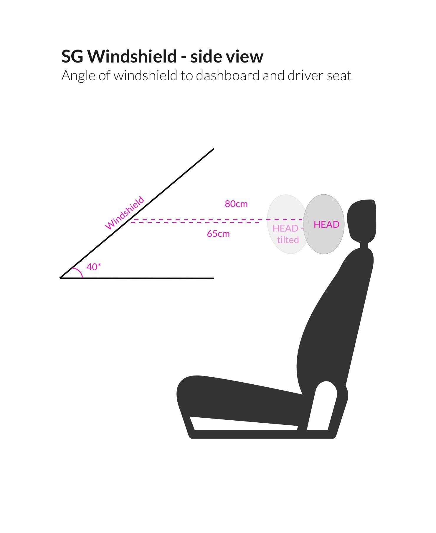
2. Projecting a UI onto a curved glass surface puts restraints on the visual output. The entire interface was not viewable by all participants in the car, and the transparency of the glass must be considered under multiple light conditions.
3. Gesture technology, and to an extent voice technology, lack user feedback.
4. Level 3 self driving cars require the driver to view the road even while in AV mode.
5. Gesture and voice recognition were limited to specific gestures and commands in this project.
6. Information user eye selection needed to be displayed at distances large enough to be detected by an eye tracker.
7. The distance between the road and the windshield cause a parallax effect. The position of the users eyes in the car greatly changes their perspective of the display compared to objects outside the vehicle.
What function does moving and manipulating elements on a windshield have for real users?
How can elements on the windshield feel more exiting and natural to interact with than design 1.0?
Without haptic affordances, how will we seamlessly indicate to users the many ways they can interact with content?
After gathering many requirements and gaining an understanding of our users and previous prototypes, I facilitated brainstorm sessions within the many technical and business teams involved. Through the process I discovered key aspects of the UX which needed to be answered:


Prototyping ideas
With so many questions in mind, I needed to prototype our ideas before moving into development. In absence of a fully functioning system, I created a Wizard-of-Oz (WOz) prototype. By faking aspects of the technical setup using simple powerpoint slides and pre-generated audio files, I was able to rapidly put into question our ideas and test key hypothesis’.
Previous design insight: Due to technical constraints, only 4 places on the windshield can display content. Drivers do not immediately know the boundaries of content placement and assume they can move widgets anywhere leading to poor usability and high error rate.
Hypothesis: Giving users explicit constraints while moving content on the windshield will lead to better usability.
Proposal: When users attempt to move content on the windshield - either by invoking a voice command (eg. “Move the music player”) or by gesture (by pointing at the music player) – the system would enter “move mode” where small indicators appeared, guiding the user to place the widget in one of 4 positions. This aided in the discoverability of how the system expected the user to act.
Lessons learned: Participants reacted well to the guiding boundaries and were able to successfully place widgets in the expected places using their hands. However, many users did not have a smooth experience if the system (human operator) introduced latency – they were not sure if they had selected a widget and would try motions multiple times. To clean up this interaction, I proposed a new visual state indicating which content was selected, and which space was currently highlighted. Making this interaction more obvious gave the users the necessary feedback for them to complete the task with ease.

When entering “move mode” guidelines appear to help user place widgets in expected location.
Previous design insight: Using plain single coloured boxes was not especially engaging for users to interact with
Hypothesis: Box design felt clunky and unexciting; a more modern design inspired by “smart mirrors” would feel more “high-tech”
Proposal: I tried removing the bounding boxes and use more striking typography to make the content seem more modern and sleek.
Lesson learned: When users interacted with this prototype, it was unclear for them that they could use their hands to grab the material and move it around.
Updated Hypothesis: The form of the content changes how a user will interact with it.
Solution: Without bounding boxes, it was hard for users to know which content was selectable and “grabable”. By bringing back solid shapes, but introducing a brighter colour scheme and additional forms, the widgets offered better affordances for interaction and still were perceived as more exciting.

Ideation using non-bounded widgets

Final UI with coloured bounded boxes
Design specifications
The final product integrates a gesture sensor, an eye tracking camera, natural language understanding (NLU), a graphic UI on the windshield and a graphic UI on the in-car display. As no specification or prototyping tools exist for hybrid multi-modal systems such as this, I needed to be flexible and creative in how I defined the desired user experience. Working collaboratively with several teams of engineers, I delivered useful documents which communicated what we had learned from our design and research phase.


Result
The final demo exceeds expectations but leaves us with questions. After 1-2 months of heavy UX ideation and research, the development team completes a fully functioning MVP of our project. We brought our prototype to the Las Vegas Consumer Electronic Show (CES) and gave hundreds of demos to various industry clients.
To gather feedback and assess if we met our original goal, we collaborated with the marking team to collect a feedback survey with some of the participants who came to visit the experience.